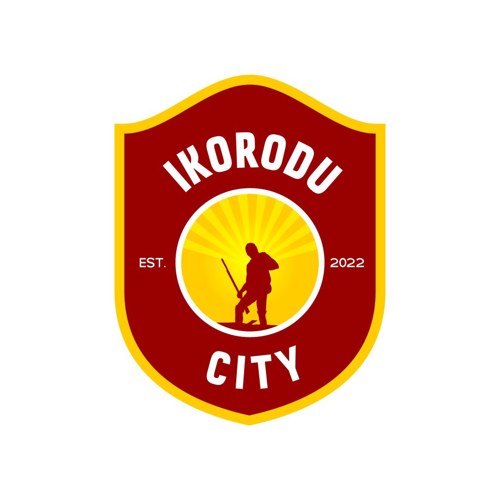
Ikorodu City Football Club have announced a new identity look with the club having a rebranded logo to fully represent its values and goals.
Established in 2022, the club has played three seasons in the second division Nigeria National League (NNL) and gained promotion to the top flight Nigeria Premier Football League (NPFL) and one of the changes ahead of the new season was a rebranded club identity to fully communicate what the club stands for.
The Club retained key representations from the previous logo including the club’s colors and hunter statue while incorporating new elements such as fonts change, founding data and crest shape.
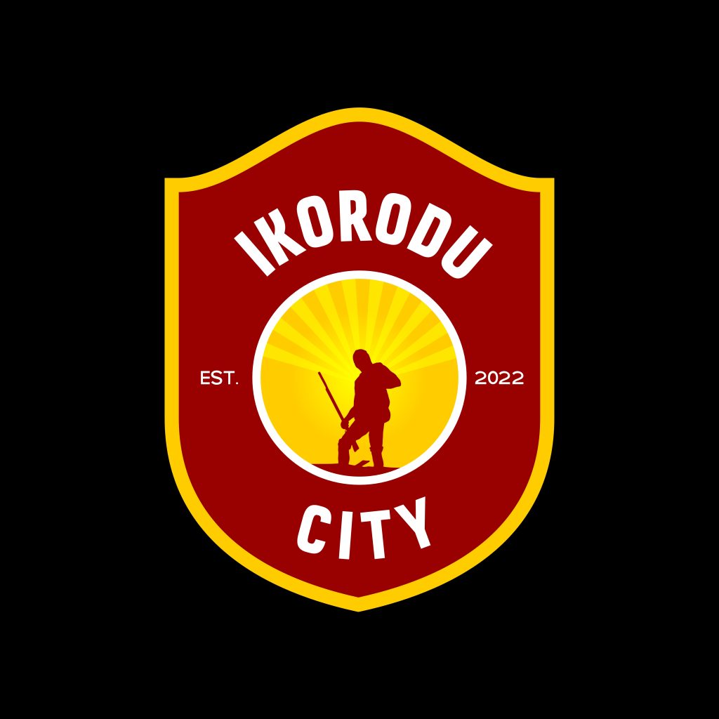
SYMBOL: a vintage-inspired logo with a detailed hunter (Oga) silhouette which is synonymous to ikorodu community enclosed in a classic heraldic shield.
CREST: moulded into the shape of a shield as a key battle weapon of the hunter.
CLUB NAME: incorporated around the inside of the club crest
FOUNDED: established in the year 2022, located both side of the hunter covered in heraldic shield.
TYPOGRAPHY: Koba fonts used for all “Ikorodu City” lettering and Galak Pro Demo for “EST 2022”.
COLOR: Club official colors of Maroon, Yellow and White.
